Payload
Fintech
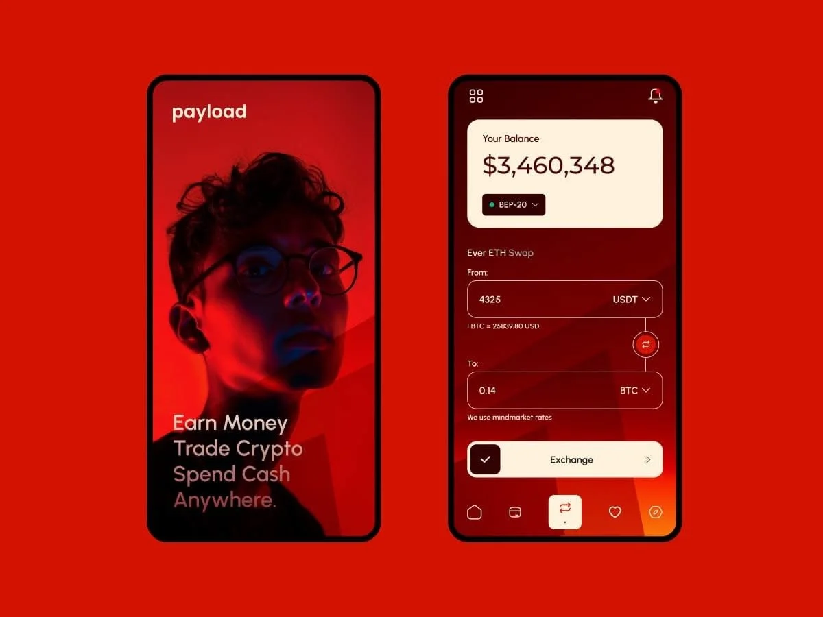
Payload is a crypto wallet built for people who actually use it. Spend, swap, earn without the noise of the rest of the category.
The product is fast and direct. The brand needed to feel the same.
-
Visual Identity · Photography · Art Direction
-
Most crypto branding falls into one of two traps. Sci-fi tech-bro or bland banking app. Payload couldn't afford either. The identity had to feel grown-up, ownable, and alive.
A brand that could sit next to Apple Pay or Cash App without flinching, while still carrying its own point of view.
-
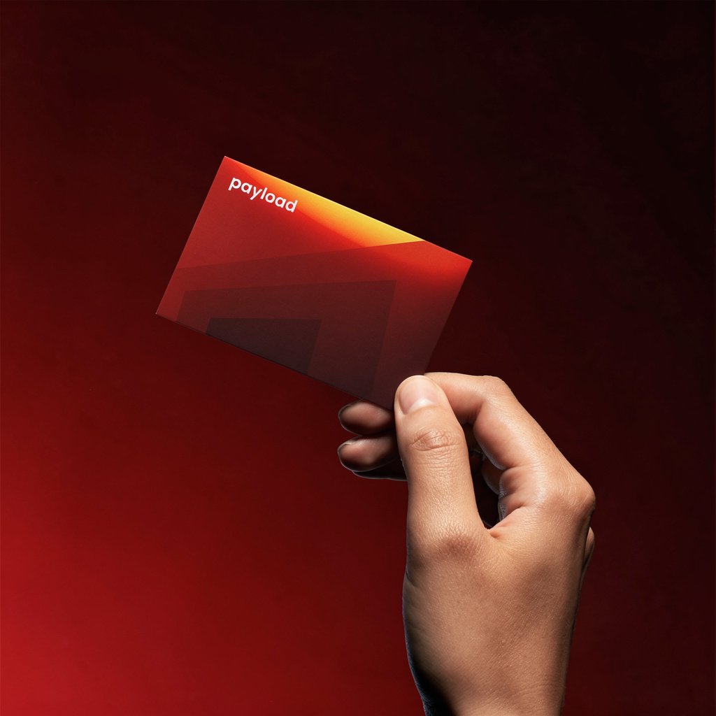
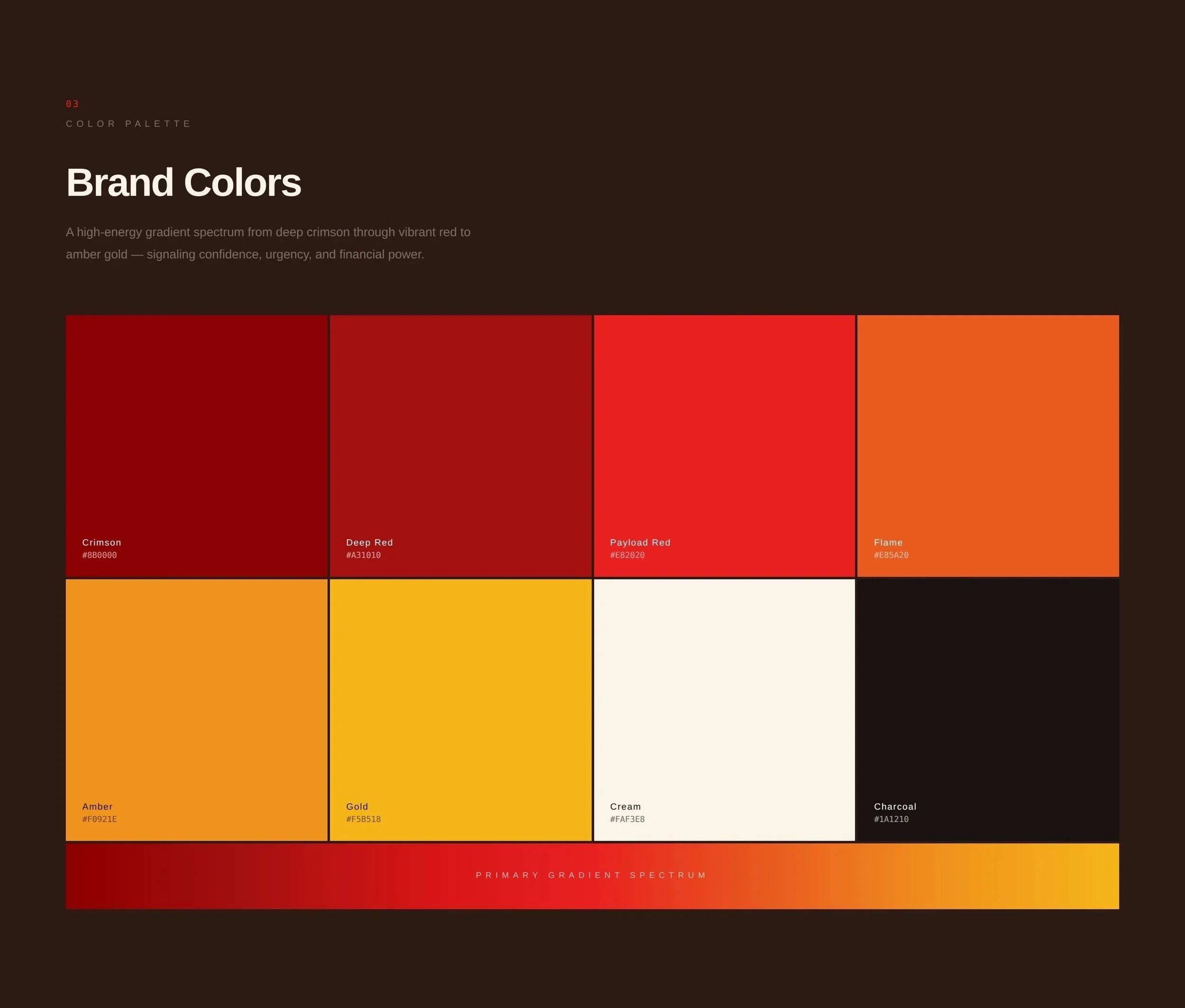
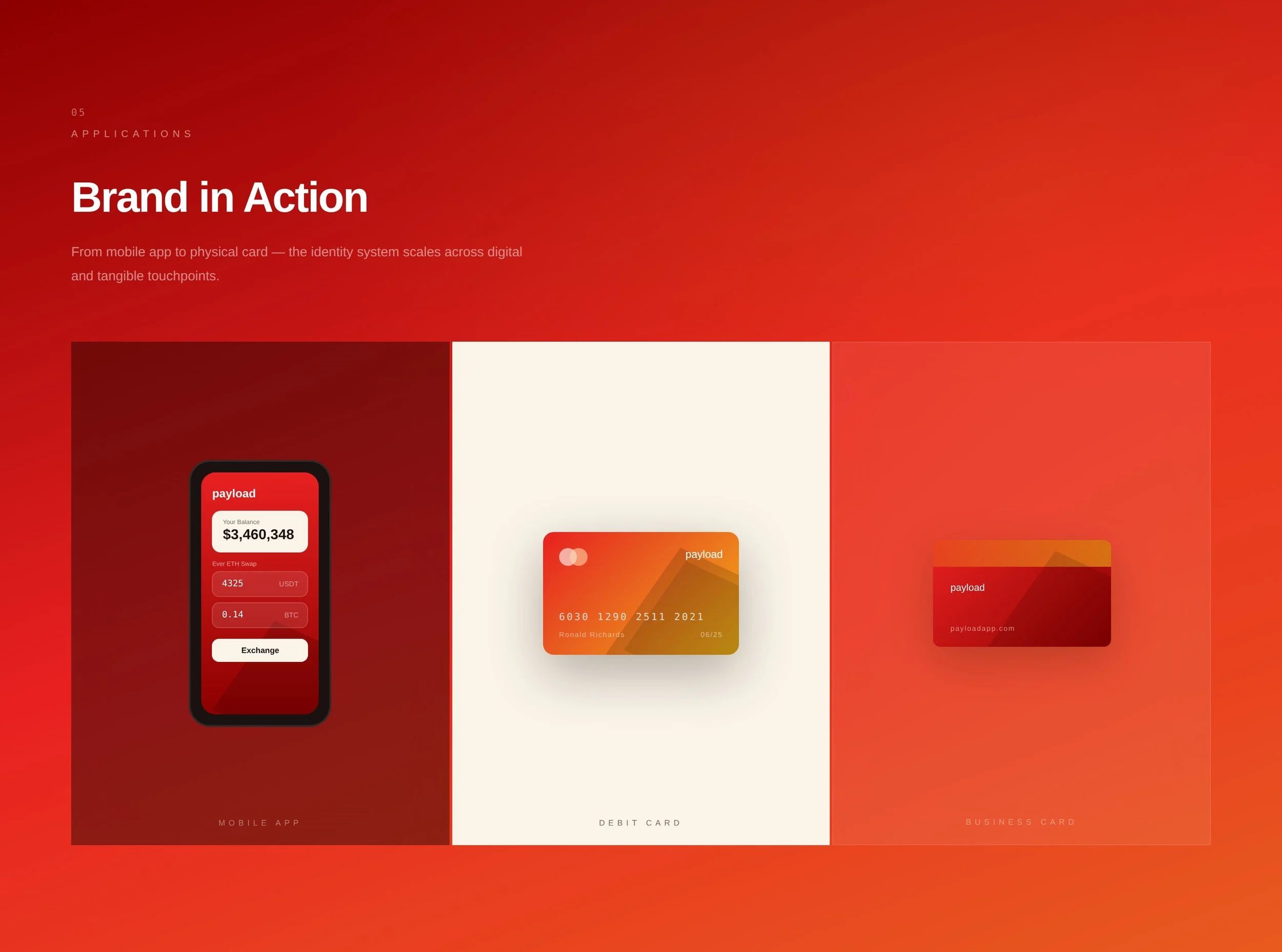
We built the identity around heat. A deep red and amber palette pulled from sunrise and signal, colours that feel digital and human at once. The mark is geometric, fast, and built to flex from app icon to physical card without losing its weight.
The photography pushed the temperature further. Portraiture lit hard and red, the card held against shadow, every frame carrying the same heat as the brand itself.
Not a fintech that wants to feel safe. A fintech that wants to feel sharp.