Espoir
Beauty & Skincare
Brand Identity · Packaging · Photography
Espoir had something many skincare brands spend years trying to build, a loyal following, a genuine ethos, and a name that carries meaning. What they didn't have was a visual identity that matched it. The brand had grown, but its look hadn't kept up. It felt dated in a category that moves fast and judges hard on first impressions.
The Brand
The Challenge
The goal wasn't to reinvent Espoir. It was to reveal what it had always been. Modern, considered, and quietly confident. We needed to strip away the visual noise of the old identity and replace it with something that felt fresh without losing the warmth that made their customers loyal in the first place.
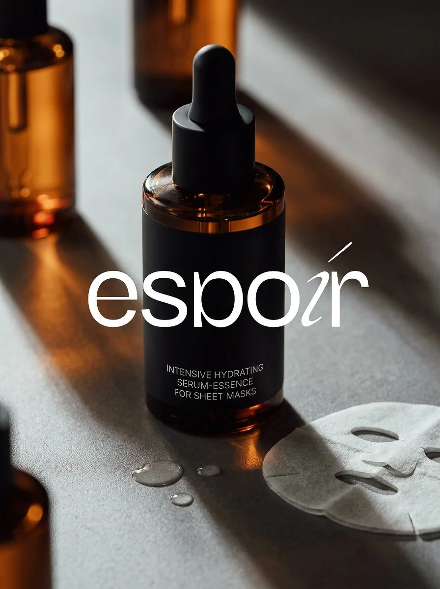
We refreshed the visual identity from the ground up, refining the logo into something cleaner and more ownable, then building an entire packaging system around it. Every material choice, typographic decision, and colour call was made to feel intentional on shelf and unmistakable in the hand.
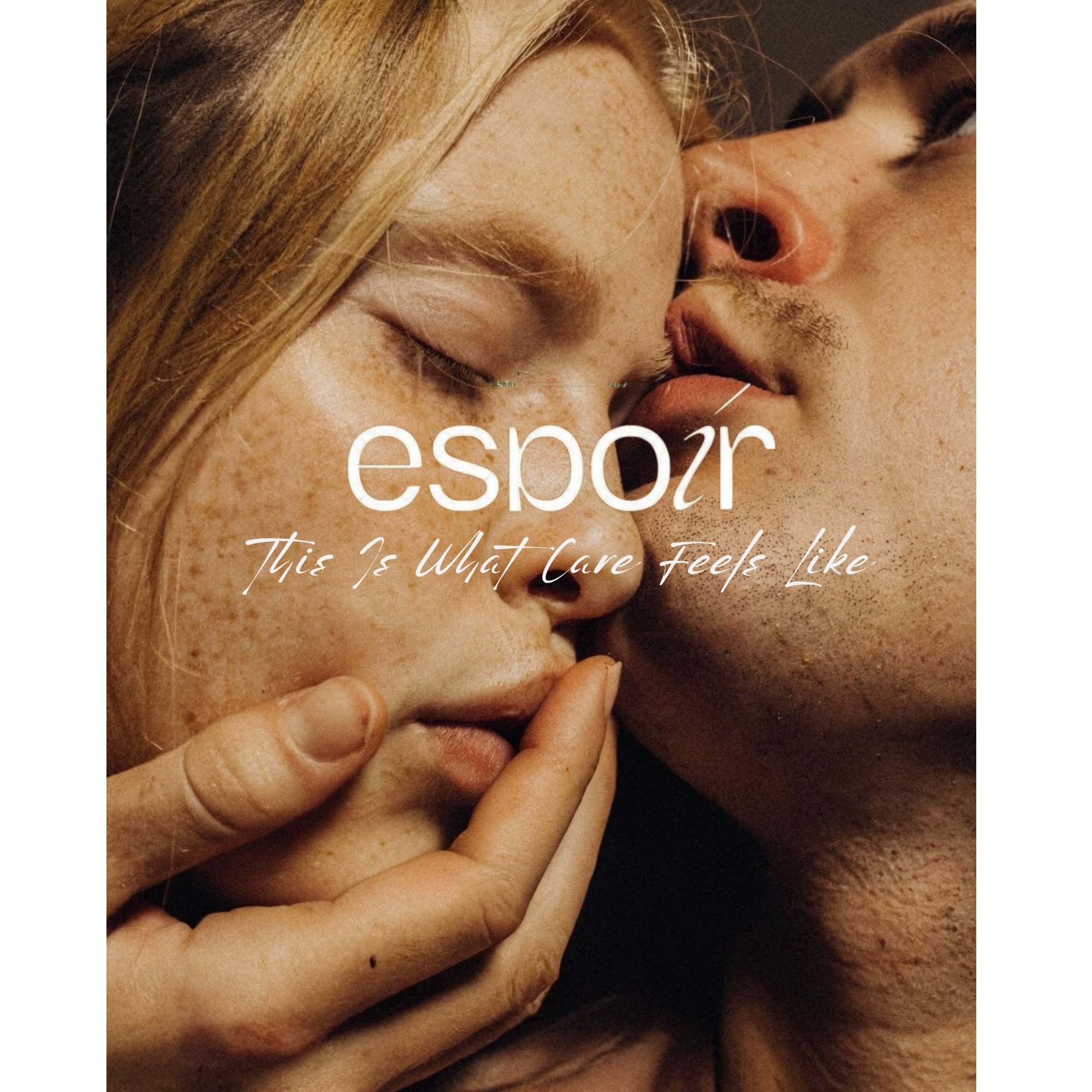
The photography and art direction brought the new identity to life. We built a visual world for the brand. soft, tactile, and human that could carry consistently across product imagery, campaign assets, and editorial content.
What We Did