CAAS
Coffee & Hospitality
Caas is a coffee house rooted in Arab tradition and the everyday ritual of slowing down. The name itself ( كأس ), means cup in Arabic. The kind of cup that holds more than coffee.
Conversation. Hospitality. Time.
-
Visual Identity · Packaging · Photography
-
Most specialty coffee branding speaks the same visual language. Sans serifs, kraft paper, minimalist white. Caas needed to belong to a different tradition entirely , one that predates third-wave coffee by a thousand years without ever feeling like decoration or pastiche.
-
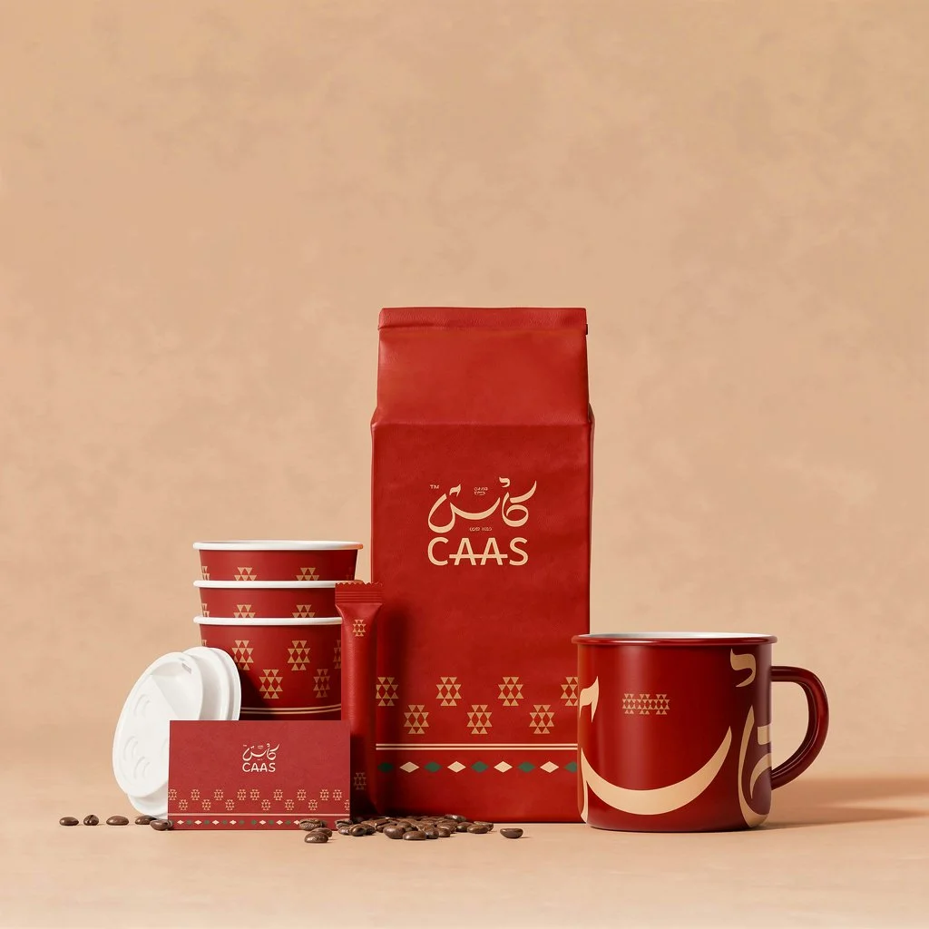
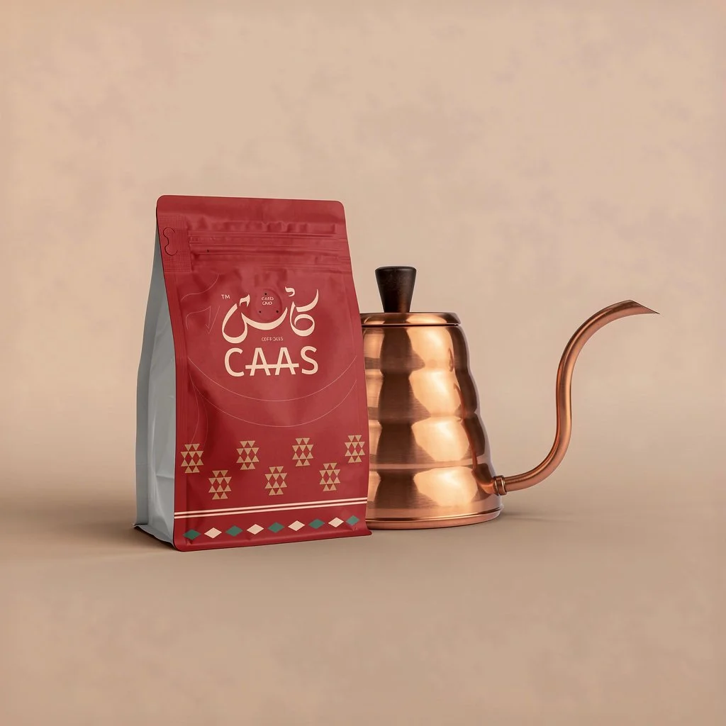
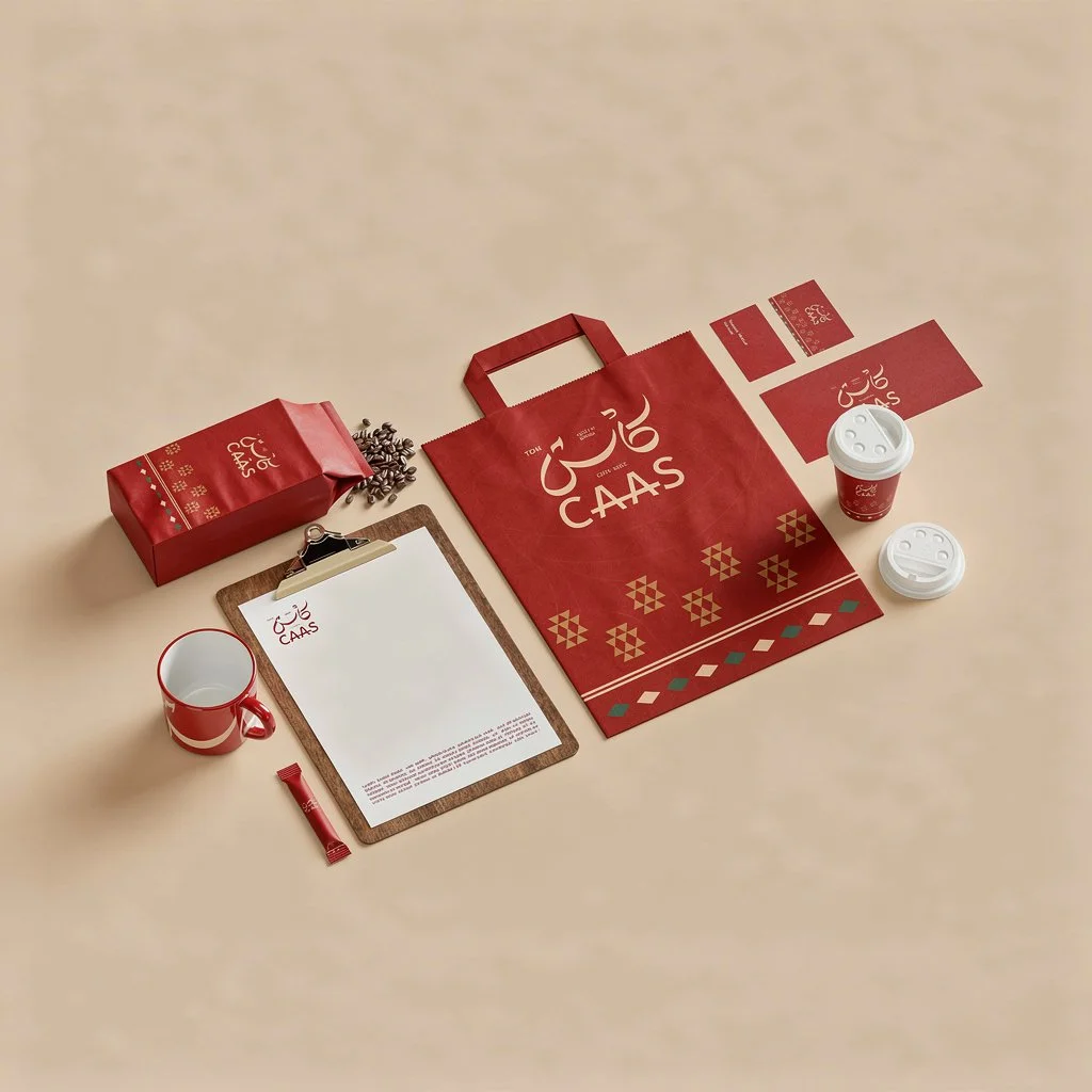
We built the identity around the calligraphic mark. Hand-drawn, anchored in classical Arabic script, paired with a Latin wordmark that holds its own beside it. Two scripts, one voice.
The system extends through a geometric pattern pulled from traditional textile work. Diamonds, triangles, cross-stitch motifs reduced to their essentials, rebuilt at the scale of packaging. Deep red and gold throughout, the colours of warmth and ceremony.
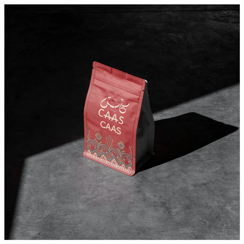
The photography lets the system speak for itself. Hard light, deep shadow, surfaces that feel like stone and skin more than studio. No props doing the work the design doesn't already do.
A coffee brand that doesn't borrow heritage. It carries it.